I’m excited to announce the launch of my brand-new website! It’s been a long time in the making, but I’m really happy with how it’s turned out. I realize, that it wasn’t long ago that the 3.0 version saw the light of day, but as time went on, I became more and more annoyed with the design choices I made at the time, mostly because it was the result of poor planning on my part – live and learn I suppose.
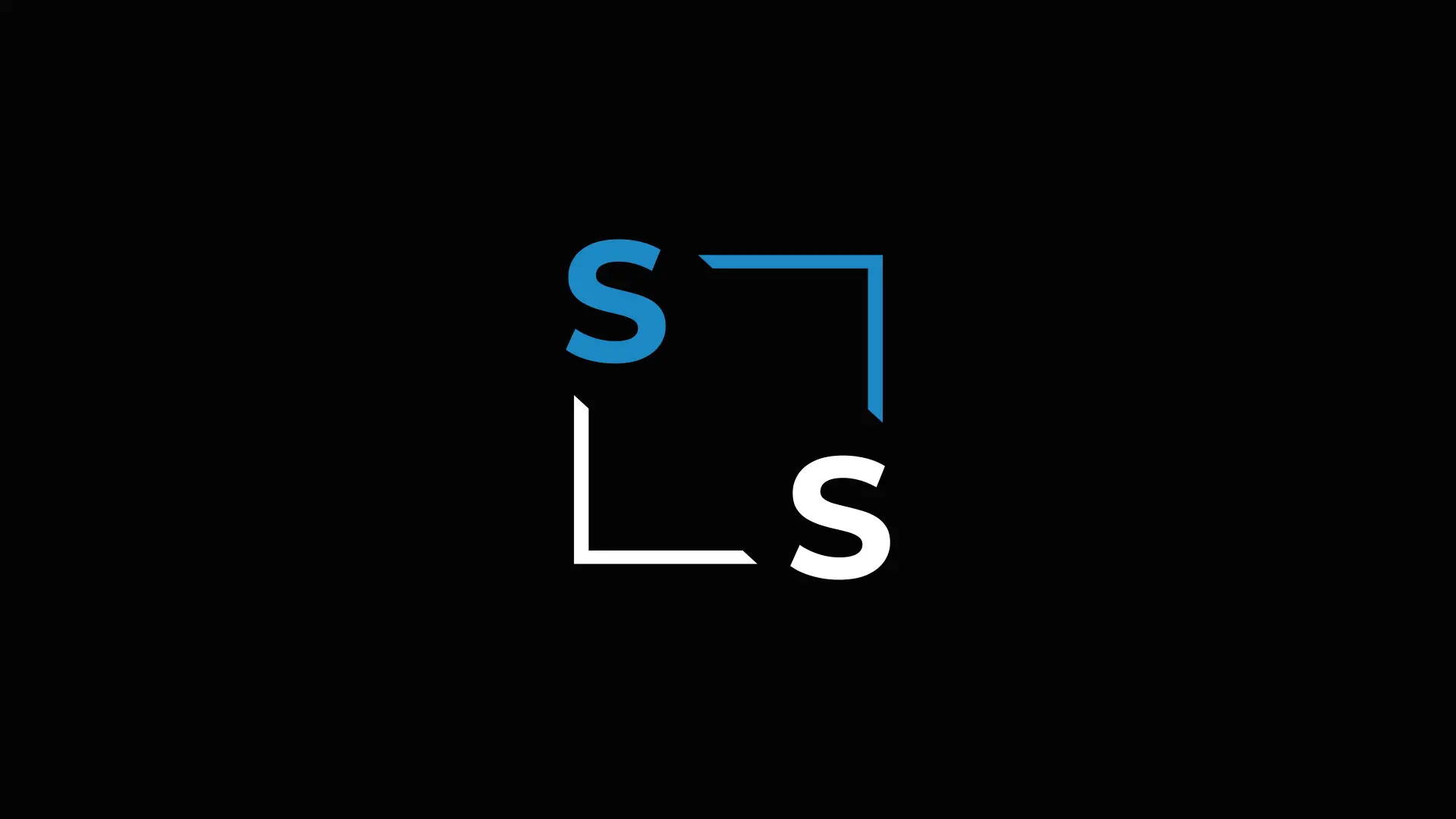
During the process of redesigning my website, I decided that it was for the best to start with a clean slate. As a result, my previous logo was also scrapped in favour of a new one to complement the new design. I felt that my old logo was giving off a vibe that felt very cramped with the way I had “shoved” my initials into a 45 degree angled square box and more or less called it a day.
With my new logo, my initials have better breathing room and I reduced the colour palette from 3 to 2 colours. While I have never been good at giving myself a pat on the back for the fruits of my labour, I feel like I can with confidence say that I am a lot happier with the results of my new logo as well as the web design for my website.
But of course being a graphics design apprentice, I know that there’s always room for improvement. So if you are reading this and want to give me a couple of pointers, I would love to hear from you!
I might create a separate post at a later point where I explain my design choices in-depth, but for now – thank you for reading and stay tuned – or don’t.
